Excel: Add an Average Line to Your Graph
Posted: Fri Feb 03, 2017 6:46 pm
In Excel when you make a graph or chart to analyze your data, an average line of the plotted data gives a better overview of the whole scenario. And it's very easy to plot such an average line to a graph.
In the following example, Column B contains sales information. I will calculate the average of the sales in Column C. For the calculation I will use absolute cells references (with the $ sign).
So in cell C2 enter
=AVERAGE($B$2:$B$8 )
Copy it down the column. The average sale is 8857 dollar.
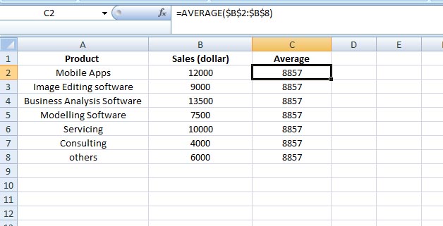
So your data is ready now.
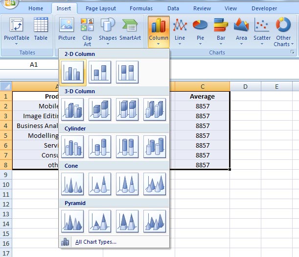
Plot the graph:
Select your data range (A1:C8)
Go to Insert tab > from the Charts group > click on Column > from the 2-D Column select the first one (Clustered Column)
Right click on any of the average bars > click Change Series Chart Type…
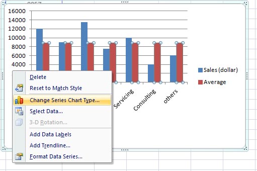
The Change Chart Type window opens. From the Line group select the first one > click OK.
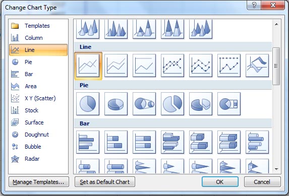
Now instead of the average bars, you have the average line in your graph.
Now right click on this average line > click on Format Data Series...
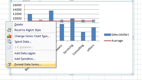
Format Data Series window opens. From the Series Options select Secondary Axis > click Close.
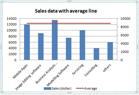
The graph is ready so far. Now do the final polishing – like adjusting the values for the vertical axes (click on any of the axes > right mouse click > click on Format Axis.... > adjust the maximum and major unit values etc. as per your preference), giving a title to your chart (you can do the title from Chart Layouts that you will get under Design tab > select any layout of your choice )
)
Have fun
In the following example, Column B contains sales information. I will calculate the average of the sales in Column C. For the calculation I will use absolute cells references (with the $ sign).
So in cell C2 enter
=AVERAGE($B$2:$B$8 )
Copy it down the column. The average sale is 8857 dollar.
So your data is ready now.
Plot the graph:
Select your data range (A1:C8)
Go to Insert tab > from the Charts group > click on Column > from the 2-D Column select the first one (Clustered Column)
Right click on any of the average bars > click Change Series Chart Type…
The Change Chart Type window opens. From the Line group select the first one > click OK.
Now instead of the average bars, you have the average line in your graph.
Now right click on this average line > click on Format Data Series...
Format Data Series window opens. From the Series Options select Secondary Axis > click Close.
The graph is ready so far. Now do the final polishing – like adjusting the values for the vertical axes (click on any of the axes > right mouse click > click on Format Axis.... > adjust the maximum and major unit values etc. as per your preference), giving a title to your chart (you can do the title from Chart Layouts that you will get under Design tab > select any layout of your choice
Have fun