So let's start:
Data Preparation:
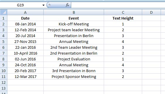
As you see in the following table, I have 3 columns. One for Date, the other one for the Events and the third one is actually a helper column to arrange the text placements on the graph.
Make the format of Column A (Date) as text format. Select the whole column by clicking on column top > right mouse click > click on Format Cells... > from under Category select Text > click OK. The rest two columns you can leave as they are, by default, in General format.
Step-by-step go with the Chart:
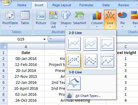
Let's make an empty line chart first. Go to Insert > from Charts group select Line with Markers
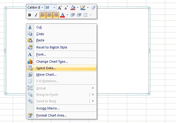
Right click anywhere on the empty Chart Area > click on Select Data... (alternatively, you can do it from under Design tab > then from Data group click on Select Data)
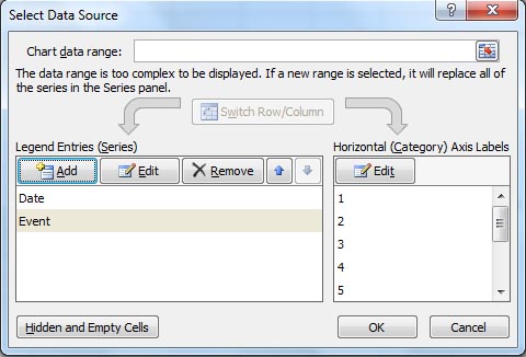
Select Data Source window opens. This is where you have to make all the play
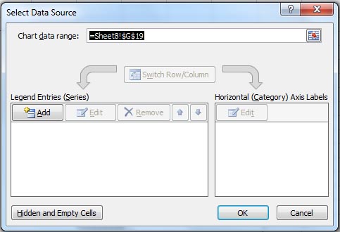
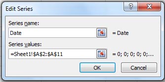
Click on Add from under Legend Entries (Series) > Edit Series window opens.
Type Date under Series name. For Series Value select the Column A (A2:A11). Click OK.
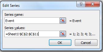
Your Select Data Source window is still open. So click again on Add > under Series name type Event but for Series values select Column C (C2:C11). Click OK.
Click OK to close the Select Data Source window for the moment. We will be back here soon
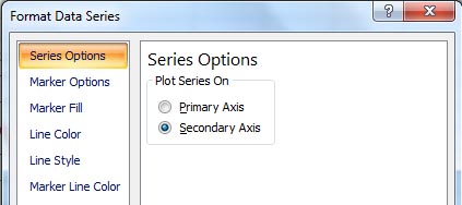
Right click on the brown Event line that you just created > click on Format Data Series... > from under Series Options select Secondary Axis > click on Close.
Now you have to go back to Select Data Source window again.
Right click again anywhere on the Chart Area > click on Select Data... (alternatively, you can do it from under Design tab > then from Data group click on Select Data)
Select Data Source window opens. The final play is here
From under Legend Entries (Series) click on Date. Date will be highlighted with blue. Now on the right side, under Horizontal (Category) Axis Labels click on Edit.
Here in the Axis label range select your date range in Column A (A2:A11). You will immediately see the dates on the X-Axis. Click OK.
Now again from under Legend Entries (Series) click on Event. Event will be highlighted with blue. Now on the right side, under Horizontal (Category) Axis Labels click on Edit.
Here in the Axis label range select your event range in Column B (B2:B11). But this time, you will not see any change like the dates above. You have to work a little more. Now click OK.
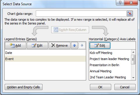
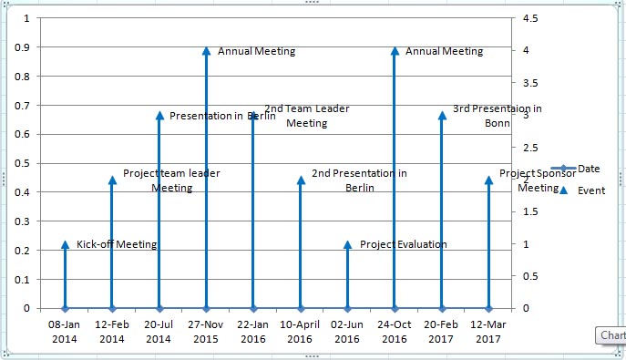
Now if you switch between Date and Event under Legend Entries (Series), you will see on the right pane it's showing you the dates and events properly. That what we wanted.
Now you can click OK to close the Select Data Source window.
By now, you have done a great part of your Milestone Chart
Final touch:
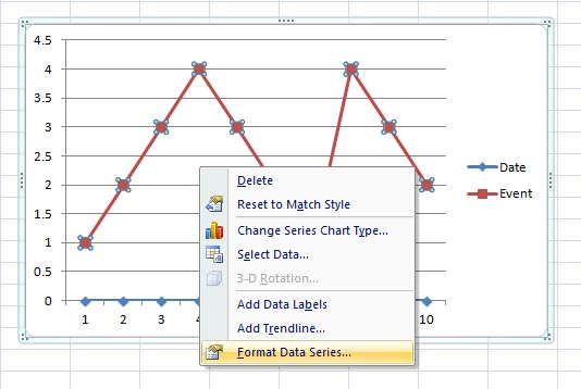
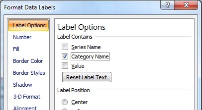
Now on your chart, right click on the brown Event line > click on Add Data Labels. You will see numbers 1, 2, 3, 4 ….. are appearing. This is not what I want, so click on any of these numbers. You will see all are selected with squares around them > right mouse click > click on Format Data Labels.... Here under Label Options, by default, Value is checked. Uncheck Vlaue and select Category Name. You will see an immediate change on your Eevent line. Click Close. Enlarge the graph area with your mouse cursor by placing it on any corner of the chart, so that you have enough space to make the events clearly visible.
Now again click on the brown Event line > right mouse click > click on Format Data Series... > click on Line Color on the left side and select No Line on the right side. You will see the Event line disappeares immediately.
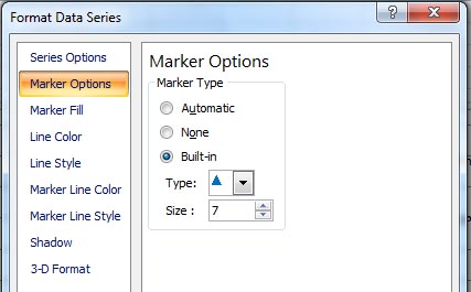
You are still within the Format Data Series window. Click on Marker Options on the left side and from under Marker Type you can choose any options like None or Built-in. I selected triangle as marker type from Built-in. Then from Marker Fill, click on Solid fill > select any color. I took the blue. From Marker Line Color, I selected Solid Line, then blue again. Click Close.
Now you need to add the Error Bars. You will get this from Layout tab > under Analysis group. So click on Error Bars > click on More Error Bars Options....
Add Error Bars dialog box opens. Select Event > click OK. But if your triangles are already in selected mode from the last step, then this Add Error bars window will not open, rather Format Error Bars window opens directly.
Now Format Error Bars window is open. Select Minus. Select No Cap. Make Percentage 100.
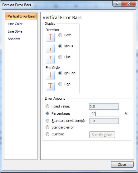
Click Close to close the window. You can also change the line color, style and width here as I did.
Make the chart clean – Beautification:
Now delete the two vertical axes from both sides of your chart. Click on each of them > right mouse click > click Delete.
Also delete the horizontal grid lines the same way. Click on any one of them > right mouse click > click Delete.
Delete also the small Legend box of Date and Event the same way > right mouse click > Delete.
With your mouse cursor, select the single Event options, like the Kick-off Meeting or Presentation in Berlin, to move them in a way to make them better visible.
To change the Font color and style > right click on the Event options (like Kick-off Meeting, all will be selected at the same time)> click on Font... > the Font window opens. Change the font size and colors of your choice, as I did
Remove the tick marks: click on any of the dates on the X-Axis > right mouse click > click on Format Axis.... Here under Axis Options choose None for Major tick mark type. Click Close.
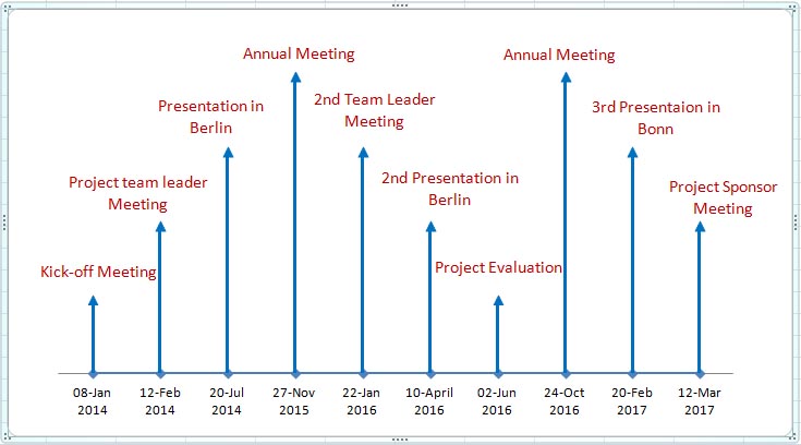
In fact you are done
You can still polish and make your chart more attractive. Just right clik on different items, go to corresponding Format options and make the necessary changes.
By the way, I am using Excel 2007.
One more thing: you will need to do this exercise several times > I will suggest, do it at least 7/8 times, to clearly get the steps – practise makes a man perfect!!
Have fun guys